
GA4 Path Exploration
Discover how to use the GA4 Path Exploration report to uncover insights into your website’s user behaviour.
If you’re creating Looker Studio reports and sending them off to clients, do you get this response?
.
.
.
.
.
That’s right, nothing.
Then it may be that your Looker Studio reports are in need of a style upgrade.
Reports should:
The last one is crucially important – data is pointless, unless it can add value to it.
This blog outlines some ways that you can, with a few simple changes,
Rather than presenting your Search Console data in a boring table format, why don’t you use a bubble chart to really illuminate where the opportunities lie with your keywords.
With your connected Search Console data, you can use ‘Query’ as your dimension.
Metric X is then average position and then Metric Y is Clicks.
The bubble size is impressions.
This will give you a visualisation that looks like the below (of course, you can change the colours etc to how you like it – I often change it to my clients branding).
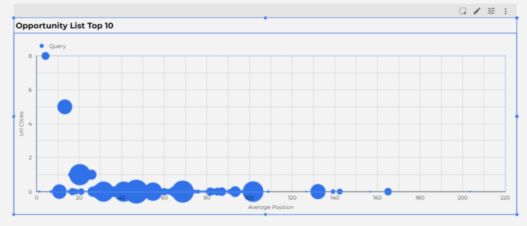
Hovering over the bubbles illuminates the query – so lets you quite quickly see which queries are:
You can choose this standard bubble chart within the standard chart functionality.
I have then prepared it by having ‘Query’ as the dimesion.
The Metric X is ‘Average Position’
The Metric Y is ‘URL Clicks’
The Bubble Size Metric is ‘Impressions’
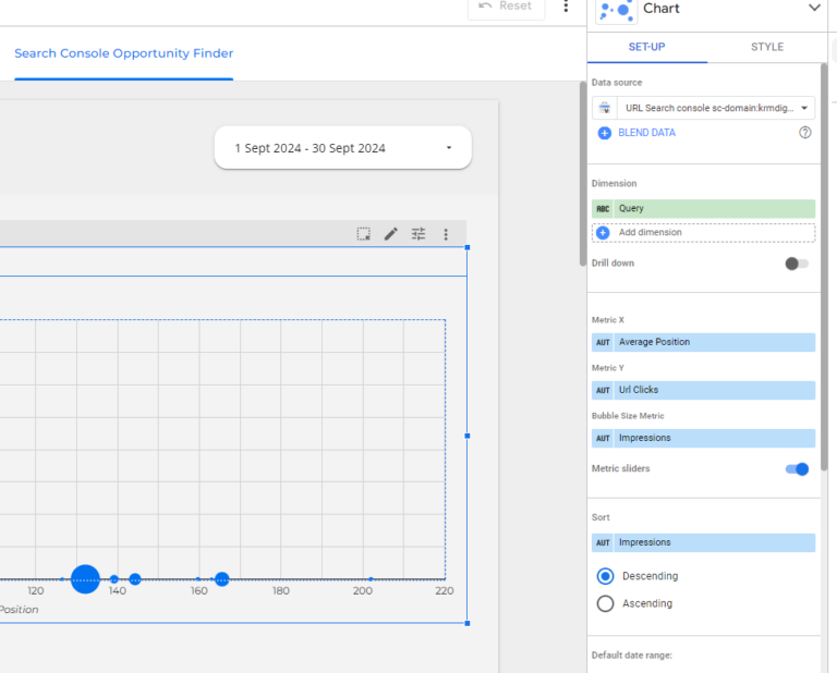
Of course, if a bubble chart sounds like too much fun, you can still create a table that highlights opportunities.
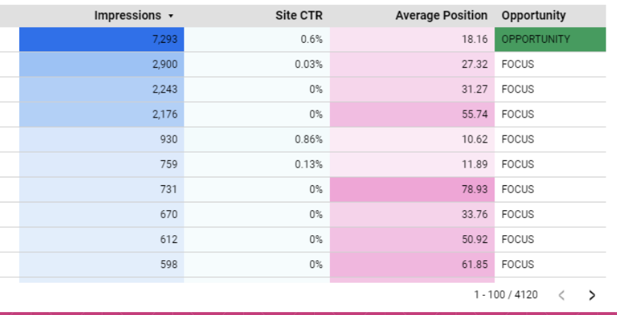
I’ve done this using a calculated field. This quickly helps to illuminate opportunities for improvement where the average position is for arguments sake under 20 and the impressions are over 1000. This can be amended to suit your organisation.
The calculated field is this:
Case
When Average Position <20
And Impressions >1000 THEN “OPPORTUNITY”
ELSE
“FOCUS”
END
I’ve then added conditional formatting to show when Opportunity arises on the table as below.
You can really take this far and add multiple conditions for different scenarios for keywords.
If you’re showing a table of data – the information alone is not hugely valuable and impactful, and let’s be honest, not hugely actionable either.

However, with just a few tweaks, your data can be more actionable.
This is where highlighting data as a percentage of total is really impactful because it means you can see how much value that particular channel or query or page is driving success.
In the example below, I’ve used Search Console, but I think one really great application is showing channel and revenue with information from GA4.

So in the above chart, I’ve duplicated the metrics URL clicks and Impressions. But I’ve changed the data to percentage of total.
I’ve then gone into the style section and changed the metrics to a Bar/Pub and included the numbers too. I’ve also changed the decimal precision to 0 for cleanliness.
Immediately, that’s highlighted an area for me to focus on – GA4 consultant. It’s driving 4% of impressions but only 2% of clicks – maybe something for me to review around how the meta description is used. Or, indeed, a longer-term project is to improve the average position.
Hopefully this video below (note, there’s no talking) will help to demonstrate how to get it done.
How often do you send a report and it’s just numbers.
How good would it be if your monthly reports also included an analysis of the previous months, or updates on progress and actions done?
Well, you can do that really easily with Google Sheets.
In the below example, I’vecreated a Google Sheets document with four headers:
(You can change this to your liking – you may find that lowlights isn’t the right terminology)
I’ve then connected this to Looker Studio.
This means that the corresponding month comes complete with a written overview of the report, and your analysis.

This is great for when you know you’re reporting to a team who profess they don’t have the time to review the data that you’re presenting.
So you can provide a snapshot for them to review – great for starting points when you join a meeting with them to report further.
Did you know you can add a GA4 code to your Looker Studio reports?
You can – and it absolutely helps you to understand how to cut the crap, trim the fat from your reports.
The reporting is fairly limited, but you can quickly see which sections of the report are viewed the most.
This helps you to understand which pages are deemed valuable for your client / organisation and which pages can be removed.
So I can tell from this report in GA4, that the Previous Year data is not valuable – which gives me insight into the clients mindframe – and helps me get rid of information they are not reading!
Huzzah! Useless data be gone!
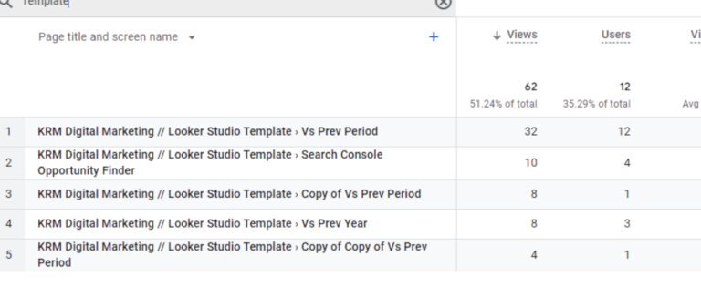
If you click on File > Reporting Settings you’ll then see an option to include a GA4 measurement ID.

Blending Sheets data with GA4 (or other data sources e.g. Search Console) means that you can add references you’ve done to the site or algorithm updates and see how that has impacted the site.
The video below from Loves Data is a great demonstration of how to do this.
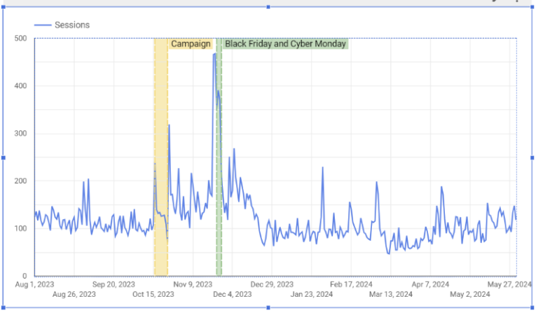
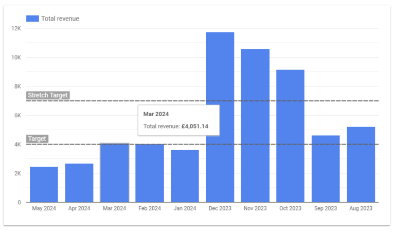
These additions provide valuable insights for those who want to visualise trends and benchmark performance over time.
You can highlight specific moments in a year that are campaign focused e.g. Black Friday.
Or how about highlighting where you are when it comes to a target – or even a stretch target.
Great to clients how you’re bossing it!
The legend that is Ahmad Kanani has produced tons of excellent Looker Studio videos.
And here’s another demonstrating the power of trendlines and references.
Oftentimes, you’re presenting your Looker Studio report to people that have never used a Looker studio report before. And that often means all your fabulous features fall by the wayside.
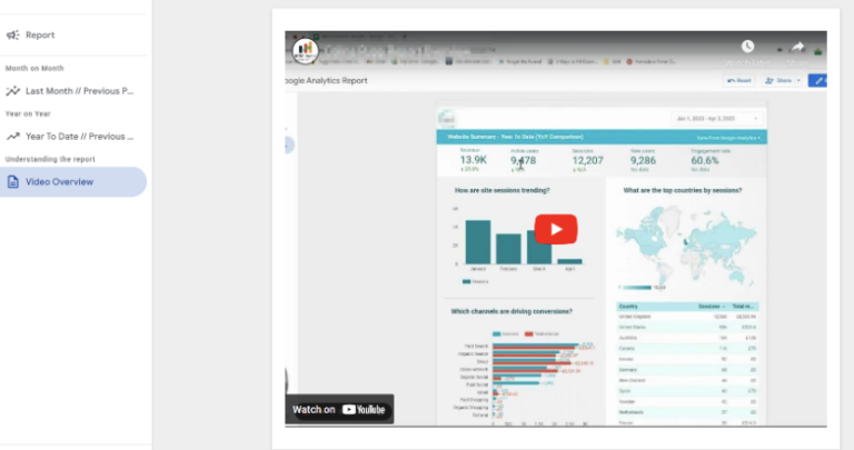
Embedding a video overview of the report is a great way to ensure that you’re enticing people to use the report to it’s full potential.
You can run through each aspect of the report and show ways to manipulate the data.
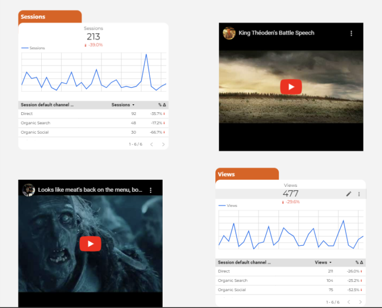
People digest data in different ways – and being able to understand that and demonstrate it on a report is a great way to get your point across to multiple users.
The ‘Tell Me’ visualisation in the Community gallery is a superb accompaniment to a report. It can provide really clear and succinct analysis that is easily accessible.

At first glance, it may appear a little difficult to understand but the guidance provided everything you need to get started with it.

You ‘eard!
Sometimes, we fall into the trap of shoving tons of data into a report in the belief that is a job well done.
Really, I think a skilled communicator is able to demonstrate everything they need with less. Less is more.
So, when building your Looker Studio report, talk to the organisation / your client / yourself and decide what’s important to track – and I mean important to track.
Remove vanity metrics (am looking at you bounce rate)
Use the language of the person reading it, not yours (We aren’t all super-skilled digital marketers).
Understand what their North Star Goals are and demonstrate these within the report.
Combine this with your GA4 analysis of which pages are reviewed and you’ll be able to craft a Looker studio report that is action after action.
Below are a few ways examples
This is the GA4 calculated field you can use if you want to amend your pages to specific groups.
CASE
WHEN (Page=”/en” OR Page=”/de” OR Page=”/es”) THEN “Home”
WHEN (REGEXP_MATCH(Page, ‘^/../shop/.*’)) THEN “Webshop”
WHEN (REGEXP_MATCH(Page, ‘^/../blog/.*’)) THEN “Blog”
WHEN (REGEXP_MATCH(Page, ‘(^/../company/.*|.*career.*)’)) THEN “Company”
ELSE “Other”
END
In GA4, if you’ve got a lot of social media traffic, and you are sick and tired of not being able to combine it to get a complete picture of a social media’s performance, then this might be for you.
Of course, you could create custom channel groups in GA4 to build a social media report.
The GA4 calculated field is below:
REGEXP_REPLACE(Session source, ‘(?i)((l|m|lm|business)\\.)?facebook\\.com’, ‘facebook’)
Here are some useful resources to help you with calculated fields:
Omisido Guide on Calculated Fields
So there you have it – really quick and easy ways to help you make simple changes to a Looker Studio report. These changes will help to illuminate actionable insights quicker and easier. Get creating today.

Discover how to use the GA4 Path Exploration report to uncover insights into your website’s user behaviour.
Are you seeing Unassigned in GA4 – what does it mean? How can you fix it?

Author
Hello, I'm Kyle Rushton McGregor!
I have been working in PPC and SEO for over a decade now. I have expertise in supporting charities, SAAS and B2C – helping them drive more traffic and conversions. My experience covers